This discussion is locked.
You cannot post a reply to this discussion. If you have a question start a new discussion

Correcting colour blindness with metasurface contact lenses

Interesting article in E&T today.

I'm sure we've all seen those viral videos of colour blind individuals being given and putting on glasses meant to help them to see the 'real' colours of the world. Now researchers have developed contact lenses designed for those with deuteranomaly, the form of colour blindness that makes it difficult to differentiate between red and green.
Parents

  • Andy Millar:

    The abstract is here https://www.osapublishing.org/ol/abstract.cfm?uri=ol-45-6-1379 which also allows access to the full paper (but that needs to be bought)

    The best public article I've found about it is here https://www.osa-opn.org/home/newsroom/2020/march/seeing_red_green_and_in_between/


    Cheers,


    Andy


    The E&T article really only scratches the surface of the subject of colour vision. Thank you, Andy Millar, for your leads. The public article from the optical society gives us a little more but does not really go into the science of colour vision. The abstract helps a little but I see no point in forking out $35 for a lengthy article of esoteric medical language, much of which I probably won't understand.


    In the post "Forum Text colours", under Online community Support, Alasdair Anderson gave some interesting experiences and useful leads.


    Posted by Alasdair Anderson on Feb 25, 2020 11:50 am


    davidwalker2:

    on-line tests are only a broad indicator of colour vision, you really need hard copy Isihara charts to be sure 


    David,

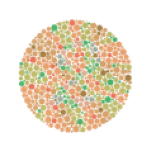
    Thanks for the warning but I was not very convinced (more surprised) by the results I got. As you say there will be variations between monitors but also the scan will introduce its own variation. I did both the Ishihara 39 Plate test and then followed it with the Farnsworth D-15 Colo(u)r Arrangement Test. For the latter I only got one colour out of position (though pretty spectacularly awry) and it judged me to have normal colour vision. For the Ishihara I had grave doubts about the result as for a handful of plates I was unable to give an answer and it seemed to discount those from the mix rather than counting them as wrong, so even the marking algorithm might be wrong. . .
    I therefore think it would be appropriate to combine some of his comments into this discussion.


    Alasdair's experiences are by no means unusual. Many people with apparent good colour vision sometimes struggle with those Ishihara tests, myself included, a lot more than 8%. Let's take a look at how they work.


    Though we tend to think in terms of three primary colours, the way in which colours are actually sensed can be described in three parameters - brightness, red-green balance and yellow-blue balance.

    (For further reading visit:  
    https://www.verywellmind.com/what-is-the-opponent-process-theory-of-color-vision-2795830)

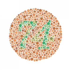
    The most common type of colour deficiency, red-green occurs when the red-green balance is displaced or inactive. Ishihara tests are designed to test this. Let us look at an example.

    86be113dae469977c20fb640d67d72da-huge-ishihara.png


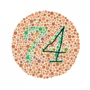
    A person with "normal" colour vision is supposed to see the numbers 74. Someone with colour deficiency (I hesitate to call it "colour blindness") may see the numbers as 21 or even 91. Examine the figure on the right. The vertical stroke of the 1 is probably visible to nearly everyone and consists of blue-green dots against a background of orange dots. This colouring continues for a short way down the slanting stroke of the 4, but changes to more of a pale yellow-green colouring, which continues along the horizontal stroke. A colour deficient person may not see the different colours against the background and would detect it as a figure 1. In the next diagram I have traced the 4 that should be seen.

    fe3221e667b4b7b6fbba5ccfbf997c3b-huge-ishiharatraced.png


    If we now look at the figure on the left, the horizontal and down-strokes of the 7 consist of a blend of yellow-green and blue-green dots which almost everyone would see. Trailing away to the right at the bottom is a "distractor" pattern - a series of blue-green dots which would appear more pronounced to a colour deficient person, who would see the yellow-blue balance well, giving the appearance of a number 2.


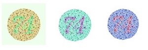
    Can colour filters assist with colour vision? I am prepared to accept that they probably can with comparisons at certain parts of the spectrum. However they may not make Ishihara tests easier to do. I processed this Ishihara chart in Photoshop to see if I could affect the test result.

    ef66317d887eea2c33252fd90e5fb093-huge-imageambiguity.jpg


     In the first diagram I have simulated a green filter, which would make reds stand out more clearly. In fact, though it makes colours appear to be more intense it does not aid the clarity of the figures; if anything it makes the chart more difficult to read. It intensifies the "distracting" yellow-blue contrasts as well as the red-green so the net gain is null.  


    In the next diagram I have adjusted the hue, which effectively performs a spectral shift and transposes reds and greens into yellows and blues which have greater intrinsic contrast. The "correct" 74 now stands out much more prominently. It is more difficult to make the "incorrect" figures stand out but I have attempted this in the third diagram with a spectral shift in the other direction, and some may see the 21 pattern. This is a re-colouration exercise and does not represent how a colour-blind person would actually see the chart.


    Some Ishihara charts are contrived so that a figure is only visible if the observer is colour blind. This sounds paradoxical but once explained it makes sense. Here is such a chart.
    925ef248cd54cb4a15b0c37807242aca-huge-p2.png


    The easiest way to demonstrate this is to do a spectral shift, as with the previous chart.

    305c08f33e5c9a633e227a3c32e76ffd-huge-p2plushue.png


    The diagram shows a "nonsense" pattern (based on red-green shades in the original chart), which is designed to obscure the actual figure which is based on yellow-blue shading. Again I have attempted a reverse spectral shift, on the right, to try to expose the hidden figure. My best guess is a figure 2, but if some see an 8 I won't be surprised.
    b107965f203725b009490c1876221e3b-huge-p2minushue.png


    The Ishihara test is clever in concept and is the most common and well-known colour test but it is not the best in my opinion. It is popular because it is cheap and convenient; it is implemented as a little booklet that can be carried in a pocket. It has the following drawbacks:

    It does not relate to practical everyday circumstances or tasks.

    It is not a pure test; it relies on recognition of characters or shapes as well as colour discrimination.

    It takes no account on the effect of the association of colour with dyslexia.


    Consider the second point above. It is perfectly possible for there to be ambiguity within black and white patterns. Here are three diagrams.

    4e8df0d054a49c5a9cd154b06d1ee7ca-huge-pictureambiguity.jpg


    The first is the familiar logo of the British Standards Institute, commonly called the "Kite mark". I am not alone in thinking that this looks more like a broken heart. If the top were a D instead of a B I might more readily associate this with a kite; if the top were an inverted V and the S missing probably still more so.


    The second is the emblem of the National Bus Company. Is it just a fancy arrow head pointing right? Look at just the top half. It is a letter N with a backward slant. The bottom is just the reflection of the top. That is all there is to it. I never noticed this until someone pointed it out.


    We have all seen pictures like the third. Is it a duck facing left or a rabbit facing right?


    My point is that if there is ambiguity, possibly not intended, in black and white pictures, then there is certainly room for ambiguity in faintly coloured shapes superimposed on other shapes deliberately designed to distract. Hence complete "success" in interpreting Ishihara charts depends to some degree on how one interprets shapes. The Farnsworth-Munsell D15 test is a portable version of a range of tests, involving selection and arranging of colour hues without reliance on shape recognition. The Farnsworth-Munsell 100 test is more elaborate and accurate and requires laboratory-type environment.  Some useful information is available at:

    https://en.wikipedia.org/wiki/Farnsworth%E2%80%93Munsell_100_hue_test


    It has been shown that dyslexic people often read text more easily when it is on a coloured background, especially yellow, than the same text on a white background. There is no obvious reason why this should be the case but it is the reason why the Barrington Stoke books are printed on pale yellow pages. Further reading on this can be found at:

    https://en.wikipedia.org/wiki/Irlen_syndrome
    https://ux.stackexchange.com/questions/73916/what-is-the-most-dyslexia-friendly-colour-combination


    Given this effect, the possibility that interpretation of an Ishihara chart may be affected by a dyslexic factor, rather than a colour vision factor, cannot be ruled out.


    Summing up, the Ishihara test is a convenient but imperfect method of testing colour vision. It is readily accountable how some people with good colour vision may have difficulty with the test. Hence I object to stories I hear about people being advised against following a career in certain occupations, on the strength of one of these tests, often presented by medical administrators or others without specialist knowledge.


    Regarding the original subject of this conversation, I believe that colour filters may help with some types of colour discrimination. They are an imperfect solution in that they can distort other colours. I don't believe that they can enable a colour blind person to see exactly as a person with normal vision can, in the same way as a concave lens can enable a short-sighted person to see at a distance just as sharply as a person with standard vision. I know of no type of filter that can perform a spectral shift.
     

Reply

  • Andy Millar:

    The abstract is here https://www.osapublishing.org/ol/abstract.cfm?uri=ol-45-6-1379 which also allows access to the full paper (but that needs to be bought)

    The best public article I've found about it is here https://www.osa-opn.org/home/newsroom/2020/march/seeing_red_green_and_in_between/


    Cheers,


    Andy


    The E&T article really only scratches the surface of the subject of colour vision. Thank you, Andy Millar, for your leads. The public article from the optical society gives us a little more but does not really go into the science of colour vision. The abstract helps a little but I see no point in forking out $35 for a lengthy article of esoteric medical language, much of which I probably won't understand.


    In the post "Forum Text colours", under Online community Support, Alasdair Anderson gave some interesting experiences and useful leads.


    Posted by Alasdair Anderson on Feb 25, 2020 11:50 am


    davidwalker2:

    on-line tests are only a broad indicator of colour vision, you really need hard copy Isihara charts to be sure 


    David,

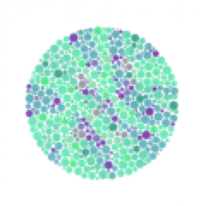
    Thanks for the warning but I was not very convinced (more surprised) by the results I got. As you say there will be variations between monitors but also the scan will introduce its own variation. I did both the Ishihara 39 Plate test and then followed it with the Farnsworth D-15 Colo(u)r Arrangement Test. For the latter I only got one colour out of position (though pretty spectacularly awry) and it judged me to have normal colour vision. For the Ishihara I had grave doubts about the result as for a handful of plates I was unable to give an answer and it seemed to discount those from the mix rather than counting them as wrong, so even the marking algorithm might be wrong. . .


    I therefore think it would be appropriate to combine some of his comments into this discussion.


    Alasdair's experiences are by no means unusual. Many people with apparent good colour vision sometimes struggle with those Ishihara tests, myself included, a lot more than 8%. Let's take a look at how they work.


    Though we tend to think in terms of three primary colours, the way in which colours are actually sensed can be described in three parameters - brightness, red-green balance and yellow-blue balance.

    (For further reading visit:  
    https://www.verywellmind.com/what-is-the-opponent-process-theory-of-color-vision-2795830)

    The most common type of colour deficiency, red-green occurs when the red-green balance is displaced or inactive. Ishihara tests are designed to test this. Let us look at an example.

    86be113dae469977c20fb640d67d72da-huge-ishihara.png


    A person with "normal" colour vision is supposed to see the numbers 74. Someone with colour deficiency (I hesitate to call it "colour blindness") may see the numbers as 21 or even 91. Examine the figure on the right. The vertical stroke of the 1 is probably visible to nearly everyone and consists of blue-green dots against a background of orange dots. This colouring continues for a short way down the slanting stroke of the 4, but changes to more of a pale yellow-green colouring, which continues along the horizontal stroke. A colour deficient person may not see the different colours against the background and would detect it as a figure 1. In the next diagram I have traced the 4 that should be seen.

    fe3221e667b4b7b6fbba5ccfbf997c3b-huge-ishiharatraced.png


    If we now look at the figure on the left, the horizontal and down-strokes of the 7 consist of a blend of yellow-green and blue-green dots which almost everyone would see. Trailing away to the right at the bottom is a "distractor" pattern - a series of blue-green dots which would appear more pronounced to a colour deficient person, who would see the yellow-blue balance well, giving the appearance of a number 2.


    Can colour filters assist with colour vision? I am prepared to accept that they probably can with comparisons at certain parts of the spectrum. However they may not make Ishihara tests easier to do. I processed this Ishihara chart in Photoshop to see if I could affect the test result.

    ef66317d887eea2c33252fd90e5fb093-huge-imageambiguity.jpg


     In the first diagram I have simulated a green filter, which would make reds stand out more clearly. In fact, though it makes colours appear to be more intense it does not aid the clarity of the figures; if anything it makes the chart more difficult to read. It intensifies the "distracting" yellow-blue contrasts as well as the red-green so the net gain is null.  


    In the next diagram I have adjusted the hue, which effectively performs a spectral shift and transposes reds and greens into yellows and blues which have greater intrinsic contrast. The "correct" 74 now stands out much more prominently. It is more difficult to make the "incorrect" figures stand out but I have attempted this in the third diagram with a spectral shift in the other direction, and some may see the 21 pattern. This is a re-colouration exercise and does not represent how a colour-blind person would actually see the chart.


    Some Ishihara charts are contrived so that a figure is only visible if the observer is colour blind. This sounds paradoxical but once explained it makes sense. Here is such a chart.
    925ef248cd54cb4a15b0c37807242aca-huge-p2.png


    The easiest way to demonstrate this is to do a spectral shift, as with the previous chart.

    305c08f33e5c9a633e227a3c32e76ffd-huge-p2plushue.png


    The diagram shows a "nonsense" pattern (based on red-green shades in the original chart), which is designed to obscure the actual figure which is based on yellow-blue shading. Again I have attempted a reverse spectral shift, on the right, to try to expose the hidden figure. My best guess is a figure 2, but if some see an 8 I won't be surprised.
    b107965f203725b009490c1876221e3b-huge-p2minushue.png


    The Ishihara test is clever in concept and is the most common and well-known colour test but it is not the best in my opinion. It is popular because it is cheap and convenient; it is implemented as a little booklet that can be carried in a pocket. It has the following drawbacks:

    It does not relate to practical everyday circumstances or tasks.

    It is not a pure test; it relies on recognition of characters or shapes as well as colour discrimination.

    It takes no account on the effect of the association of colour with dyslexia.


    Consider the second point above. It is perfectly possible for there to be ambiguity within black and white patterns. Here are three diagrams.

    4e8df0d054a49c5a9cd154b06d1ee7ca-huge-pictureambiguity.jpg


    The first is the familiar logo of the British Standards Institute, commonly called the "Kite mark". I am not alone in thinking that this looks more like a broken heart. If the top were a D instead of a B I might more readily associate this with a kite; if the top were an inverted V and the S missing probably still more so.


    The second is the emblem of the National Bus Company. Is it just a fancy arrow head pointing right? Look at just the top half. It is a letter N with a backward slant. The bottom is just the reflection of the top. That is all there is to it. I never noticed this until someone pointed it out.


    We have all seen pictures like the third. Is it a duck facing left or a rabbit facing right?


    My point is that if there is ambiguity, possibly not intended, in black and white pictures, then there is certainly room for ambiguity in faintly coloured shapes superimposed on other shapes deliberately designed to distract. Hence complete "success" in interpreting Ishihara charts depends to some degree on how one interprets shapes. The Farnsworth-Munsell D15 test is a portable version of a range of tests, involving selection and arranging of colour hues without reliance on shape recognition. The Farnsworth-Munsell 100 test is more elaborate and accurate and requires laboratory-type environment.  Some useful information is available at:

    https://en.wikipedia.org/wiki/Farnsworth%E2%80%93Munsell_100_hue_test


    It has been shown that dyslexic people often read text more easily when it is on a coloured background, especially yellow, than the same text on a white background. There is no obvious reason why this should be the case but it is the reason why the Barrington Stoke books are printed on pale yellow pages. Further reading on this can be found at:

    https://en.wikipedia.org/wiki/Irlen_syndrome
    https://ux.stackexchange.com/questions/73916/what-is-the-most-dyslexia-friendly-colour-combination


    Given this effect, the possibility that interpretation of an Ishihara chart may be affected by a dyslexic factor, rather than a colour vision factor, cannot be ruled out.


    Summing up, the Ishihara test is a convenient but imperfect method of testing colour vision. It is readily accountable how some people with good colour vision may have difficulty with the test. Hence I object to stories I hear about people being advised against following a career in certain occupations, on the strength of one of these tests, often presented by medical administrators or others without specialist knowledge.


    Regarding the original subject of this conversation, I believe that colour filters may help with some types of colour discrimination. They are an imperfect solution in that they can distort other colours. I don't believe that they can enable a colour blind person to see exactly as a person with normal vision can, in the same way as a concave lens can enable a short-sighted person to see at a distance just as sharply as a person with standard vision. I know of no type of filter that can perform a spectral shift.
     

Children
No Data