This discussion has been locked.
You can no longer post new replies to this discussion. If you have a question you can start a new discussion

I hope the Climate Activists are proud of the effect their lies are having on the younger generation

If this survey is real the messages these young people are receiving are completely wrong.

We need to reduce our impact on our planet but CO2 is a complete red herring. The current ECS (temperature increase for a doubling of CO2 in the atmosphere) is centred around 3°C (IPCC AR6). The 2°C will destroy civilisation is simply made up.


Parents
  • Peter,

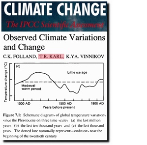
    According to previously accepted climate science up to and including the first IPCC  AR there was a Medieval Warm Period and a Little Ice Age. These did not fit well with the CO2/AGW theories and were downgraded to limited northern hemisphere weather phenomena. Simon Baker repeats this premise earlier in this thread.

    6510463147c6ff702ccc2244da2bdc59-original-ipcc-mwp.jpg

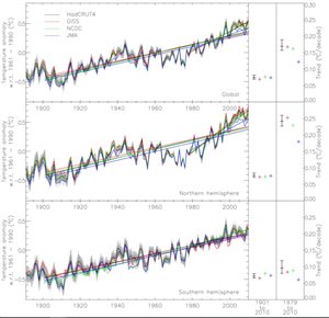
    If that is the case then trying to base AGW on a limited northern hemisphere weather pattern is similarly not valid. If you look at the Met office combined graph the rapid ~1°C temperature rise between 1970 and 2000 only appears in the northern hemisphere. It does not appear in the southern hemisphere.

    3fe9ef751c1b88c6653a3131d1b7130d-original-hadcrut.jpg

    This gives two scenarios:

    1) The MWP and LIA are valid climate effects and need to explained by the climate models especially the anthropogenic factors.

    2) The CET rise from 1950 used by Stott is merely a northern hemisphere weather effect and can be ignored. Therefore it is not caused by anthropogenic factors.

    You can’t have it both ways.

    The third option:

    3) AGW effects do exist but are much weaker than the natural climate effects so the current models grossly overestimate them.


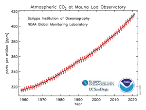
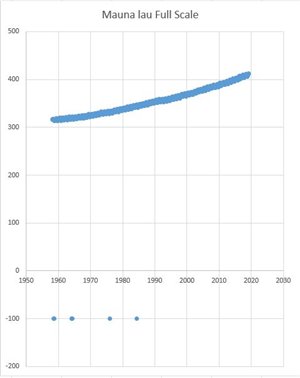
    The key difference between AR5 and AR6 is the measured temperature lines. In AR5 they have levelled off and are about to break out of the lower edge of the predictions, the black line in the black circles. In AR6 there is a steep increase in the measured temperature from around 2010 which is not adequately explained but takes them back to Dr Michael Mann’s hockey stick. You can’t attempt to scare the population, especially the younger generation, if the temperature rise is flattening off. A steep rise is what you need. In the same way the Mauna Loa CO2 values are always shown on a graph with a truncated Y axis to accentuate the rise. It’s quite easy to download the data and produce an unbiased graph.

    fa9bd7f1631fbff3245ae4cfad46793a-original-co2_data_mlo.png
    90b0c02392248ad7bc521aaf5fc2cfce-original-mauna-loa-full-scale.jpg


Reply
  • Peter,

    According to previously accepted climate science up to and including the first IPCC  AR there was a Medieval Warm Period and a Little Ice Age. These did not fit well with the CO2/AGW theories and were downgraded to limited northern hemisphere weather phenomena. Simon Baker repeats this premise earlier in this thread.

    6510463147c6ff702ccc2244da2bdc59-original-ipcc-mwp.jpg

    If that is the case then trying to base AGW on a limited northern hemisphere weather pattern is similarly not valid. If you look at the Met office combined graph the rapid ~1°C temperature rise between 1970 and 2000 only appears in the northern hemisphere. It does not appear in the southern hemisphere.

    3fe9ef751c1b88c6653a3131d1b7130d-original-hadcrut.jpg

    This gives two scenarios:

    1) The MWP and LIA are valid climate effects and need to explained by the climate models especially the anthropogenic factors.

    2) The CET rise from 1950 used by Stott is merely a northern hemisphere weather effect and can be ignored. Therefore it is not caused by anthropogenic factors.

    You can’t have it both ways.

    The third option:

    3) AGW effects do exist but are much weaker than the natural climate effects so the current models grossly overestimate them.


    The key difference between AR5 and AR6 is the measured temperature lines. In AR5 they have levelled off and are about to break out of the lower edge of the predictions, the black line in the black circles. In AR6 there is a steep increase in the measured temperature from around 2010 which is not adequately explained but takes them back to Dr Michael Mann’s hockey stick. You can’t attempt to scare the population, especially the younger generation, if the temperature rise is flattening off. A steep rise is what you need. In the same way the Mauna Loa CO2 values are always shown on a graph with a truncated Y axis to accentuate the rise. It’s quite easy to download the data and produce an unbiased graph.

    fa9bd7f1631fbff3245ae4cfad46793a-original-co2_data_mlo.png
    90b0c02392248ad7bc521aaf5fc2cfce-original-mauna-loa-full-scale.jpg


Children
No Data